Steg.AI
Designer & Engineer
2023
Steg.AI is a B2B SaaS startup, in which their core product is invisible forensic watermarking on digital assets (like photos, videos, and PDFs) through their APIs or web application. My role in this project was to redesign the web app's usage page and implement it in code.
User Research
What are our customers' pain points & wants / needs?
Through conversations with our customers to research their pain points and wants / needs, we found that they wanted to see their data beyond just a given month. This makes sense since a lot of our partnerships with large enterprises are based on annual contracts so they want to see an overview of their entire usage data. They also wanted to gain more valuable insight into how they're spending their tokens and who is spending tokens under an organization's account.
Defining the Problem & Goal
What's the problem, and what are we trying to achieve for our customers?
Other than the clear visual design issues (such as inaccessible and incorrect use of the brand's colors), the usage page offered no valuable data insights for our customers with its limited capabilities, which was evident from the user research.
To fix this and provide a better experience, the goal is to elevate the usage insights through richer, interactive data visualizations and features, while incorporating the brand's styling.
Target Audience
Who is our end user?
It's important to establish what kind of audience we're designing for to help guide our design direction. Since Steg is a B2B SaaS company, our primary target is large enterprises, which isn't a surprise.
However, I've noticed that a lot of interested and potential customers were also smaller-scale companies/startups, as well as individuals looking to watermark their images so this was something that I was cognizant about.
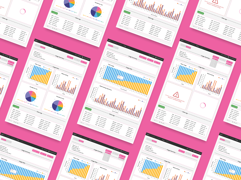
Inspiration & Wireframing
After defining the guidelines for this project, I begin the ideation phase in which I initially like to explore and research designs / components from other mockups and popular apps as examples to see what's working for users, get inspired and think of how I can begin sketching my designs, and help me stay up-to-date on design trends.
Then, I like to mentally visualize what different parts of the app could look like and translate that into rough, low-fidelity sketches. Some example wireframes are:
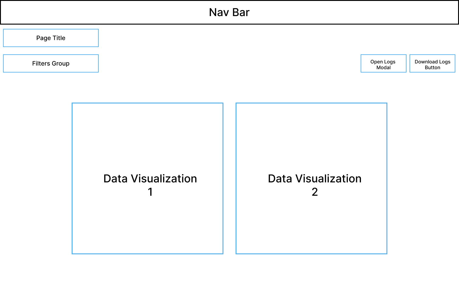
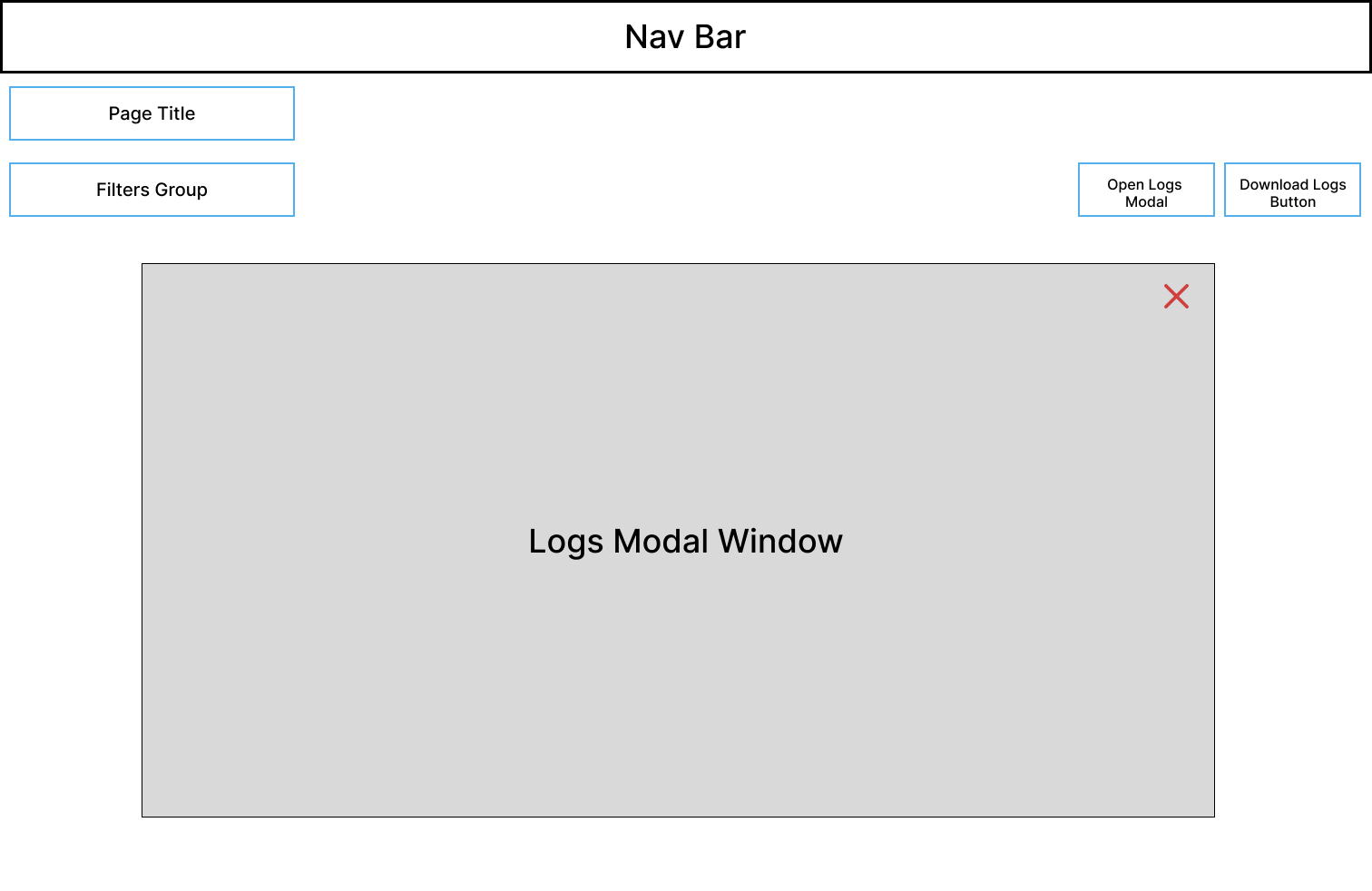
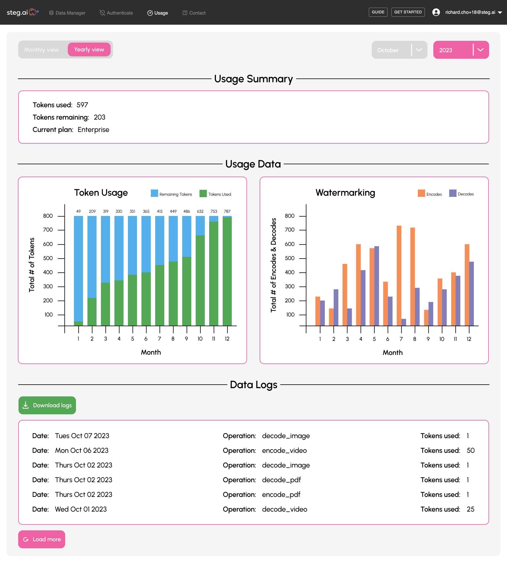
Iteration 01
Initial features and layout
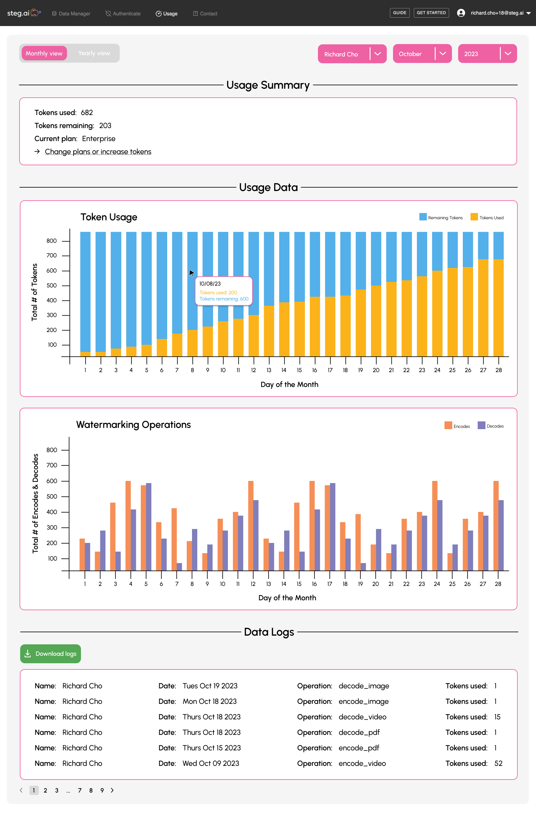
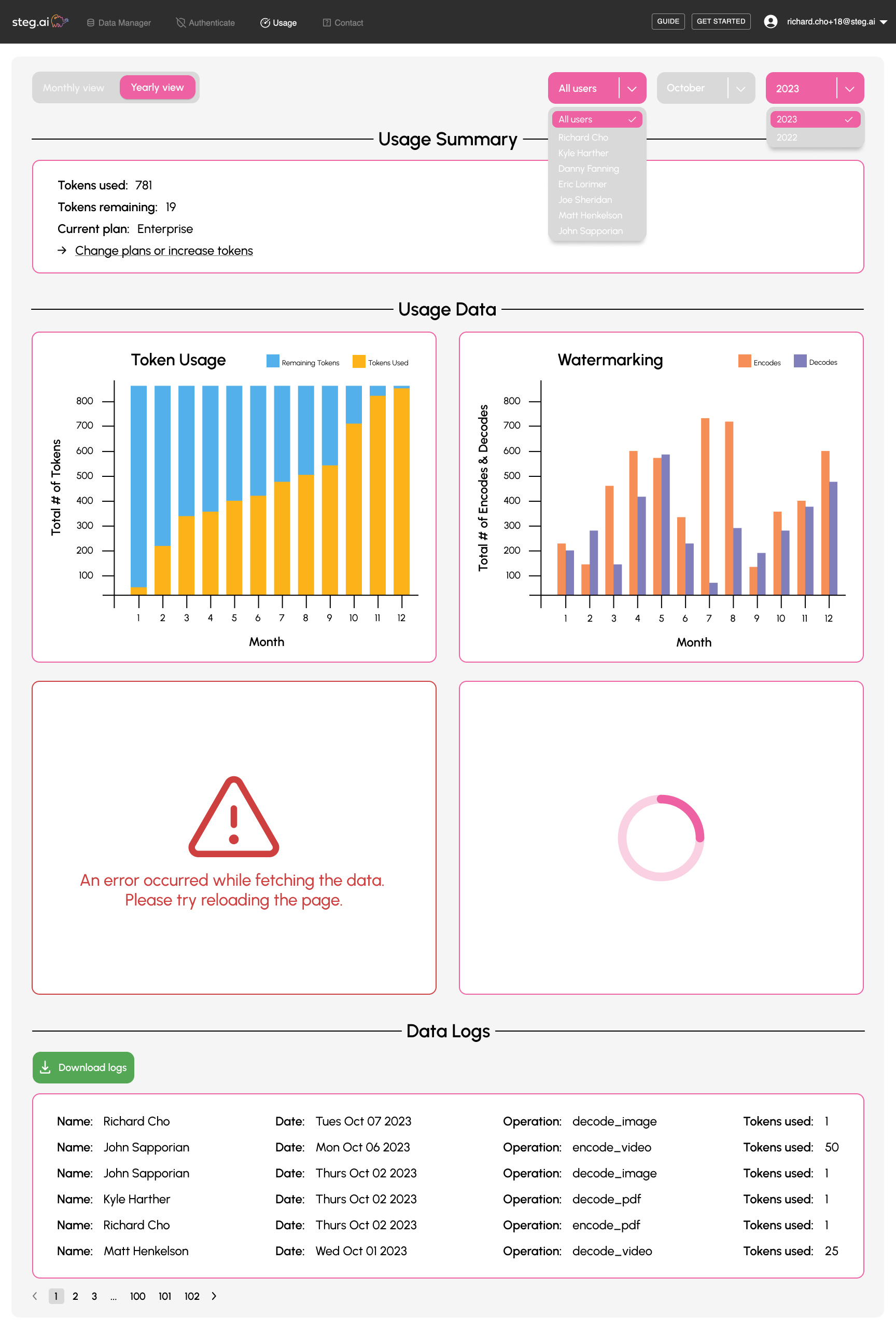
After wireframing and sketching potential ideas to establish more sense of the design direction, this was the outcome of the first high-fidelity mockup. Some of the main features are: toggling between monthly and yearly views, displaying data visualizations to easily digest large and complex amounts of data, and viewing or downloading detailed logs of account activity.
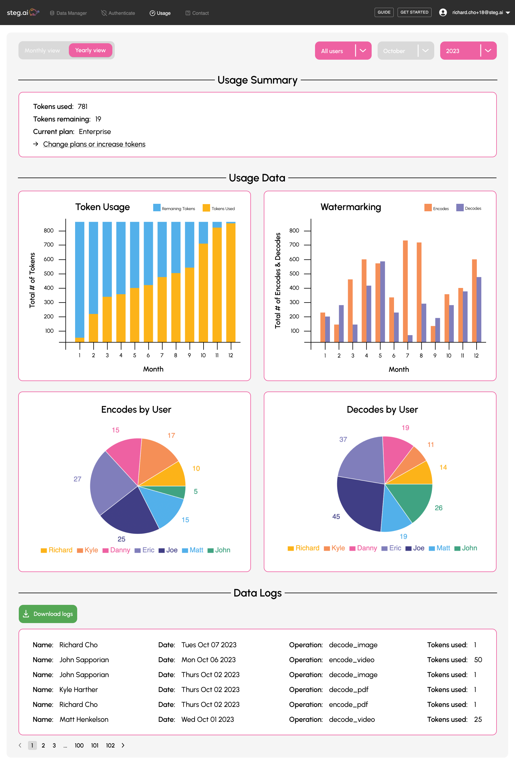
Iteration 02
Accessibility and iterating on features
From stand ups with the team and weekly demos, I was able to get feedback to iterate over: Users can now easily upgrade their plans or tokens via a call-to-action link to remove friction in the upgrade process, filter even more of the data down to specific users in an organization's account, interact with the data visualizations through hover states, and see even more contextual details in the logs (specifically on who performed what action) with a better way to parse through the table using pagination.
Something that I kept in mind was accessibility, specifically around the combination of colors used for the first bar chart. Blue and green can be hard to differentiate for users with color blindness so I updated it to create a better contrast.

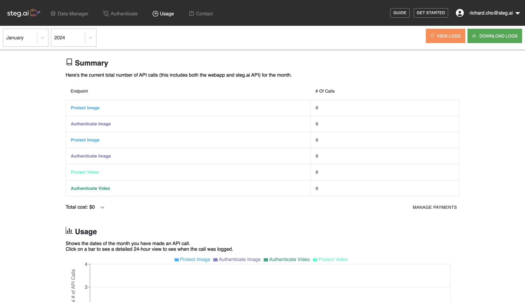
Iteration 03
Edge cases
It's important to have information communicated to users whenever something goes wrong in order to avoid confusion and frustration, otherwise that contributes to an overall bad experience, so I considered what the different possible edge cases (like error and loading states) and dropdown menus could look like.
Final Results & Impact
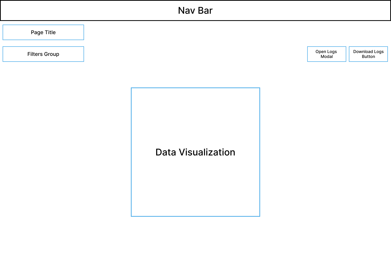
Overall, at a high level, I incorporated the brand's colors and style guidelines, and leveraged our users' feedback in creating visualizations that actually add valuable insights to their usage data. I was also mindful to modularize the layout of the design and componentize elements so that it'd be more efficient when implementing it in code for quick iterations and for the future if features were removed or added. If I had more time, I would've liked to continue iterating on the designs, but given the timeline of the product roadmap and different constraints, this was enough for V2, which shows in the overall impact.
One of the main principles I emphasize is the importance of data, and in this case, it's a good way to quantifiably measure how well the redesigns did. To measure user impact, we used Pendo as our product analytics tool to capture user behavior and engagement metrics on the web app. We found that the average time spent on the usage page jumped up to 1m 29s, which is a 345% increase, and our PES (Product Engagement Score) improved to 79% as well, which is a 7.36% increase. Although the average time metric isn't an effective indicator of success by itself, coupled with the increased PES, it's clear that our customers are engaging with the redesigned page more.
Qualitatively, there was also impact within the team. Since the usage page was the first page that I redesigned in the overall project of revamping the entire web app, I saw this as an opportunity to establish the foundations for a design system (color + typography guidelines, components, etc.). I also translated the guidelines from the design system into code for the frontend styling framework we used as an engineering team. This really helped in fast iterations and overall implementation in code since we're a super small startup.