Hercules: Streamlining Laundry Management
Designer
2024
Hercules is a laundry outsource company that provides end-to-end laundry room design, installation, management, and service to housing complexes, universities, etc. As a case study and personal design challenge, I redesigned the mobile app that allows users to digitally manage their laundry machines.
User Research
What are our users' pain points & wants / needs?
Conducting research with 10 users to gain initial insights, the main issues they were experiencing were paying for laundry and not knowing the status of their laundry, as shown through some of their responses:
- “Card reloading machines sometimes can't read my credit card, and laundry cards don't work 100% of the time.”
- “Not knowing when laundry is done, needing to use quarters to pay, and fear of someone taking my laundry.”
- “The time it takes to do it and refilling my laundry card (the reloading machine only takes $10 or $20 bills so it's very annoying).”
- “My laundry room is shared so I hate going there to find out all the machines are busy. When I go to get my laundry after I set a timer, sometimes the washer is still going and I have to either wait or go back to my apartment.”
- “I would love a cash balance mechanism.”
- “Ability to pay directly from the app with Apple Pay. I would also want features letting me know which number machine I am currently using and how much time I have.”
- “When next machine is available and what machines are available.”
- “To see how many machines are in use or free in my laundry room. Letting me know exactly when my machine is finishing.”
- “Digital queue for a specific machine, map of machines in a room, and real time updates of laundry.”
Defining the Problem & Goal
What's the problem, and what are we trying to achieve for our users?
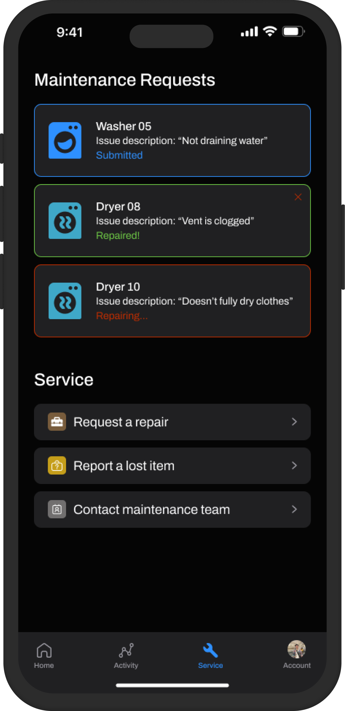
From the user research, we can define the problem and our goal. While the app tries to digitize the laundry process, it lacks complete features that make it helpful for users, specifically around the payment process and laundry status capabilities, so the goal is to improve the user's experience by streamlining the frustrating and time-consuming process of doing laundry, while unifying the app's visual design.
Target Audience
Who is our end user?
We already have an idea of the type of users for this app, but it's still good establish what kind of audience we're designing for to help guide our design direction.
Apartment renters in housing complexes (especially in metropolitan cities) and university students living in dormitories are the primary users.
Inspiration & Wireframing
After defining the guidelines for this project, I begin the ideation phase in which I initially like to explore and research designs / components from other mockups and popular apps as examples to see what's working for users, get inspired and think of how I can begin sketching my designs, and help me stay up-to-date on design trends.
Then, I like to mentally visualize what different parts of the app could look like and translate that into rough, low-fidelity sketches. Some example wireframes are:
Iteration 01
Initial layout and categorization
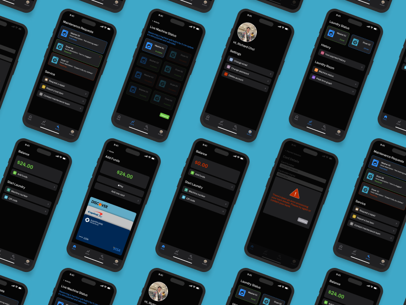
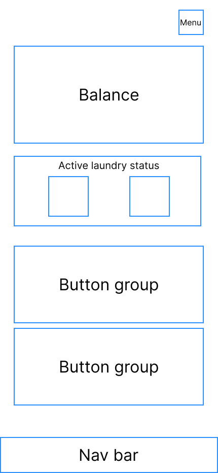
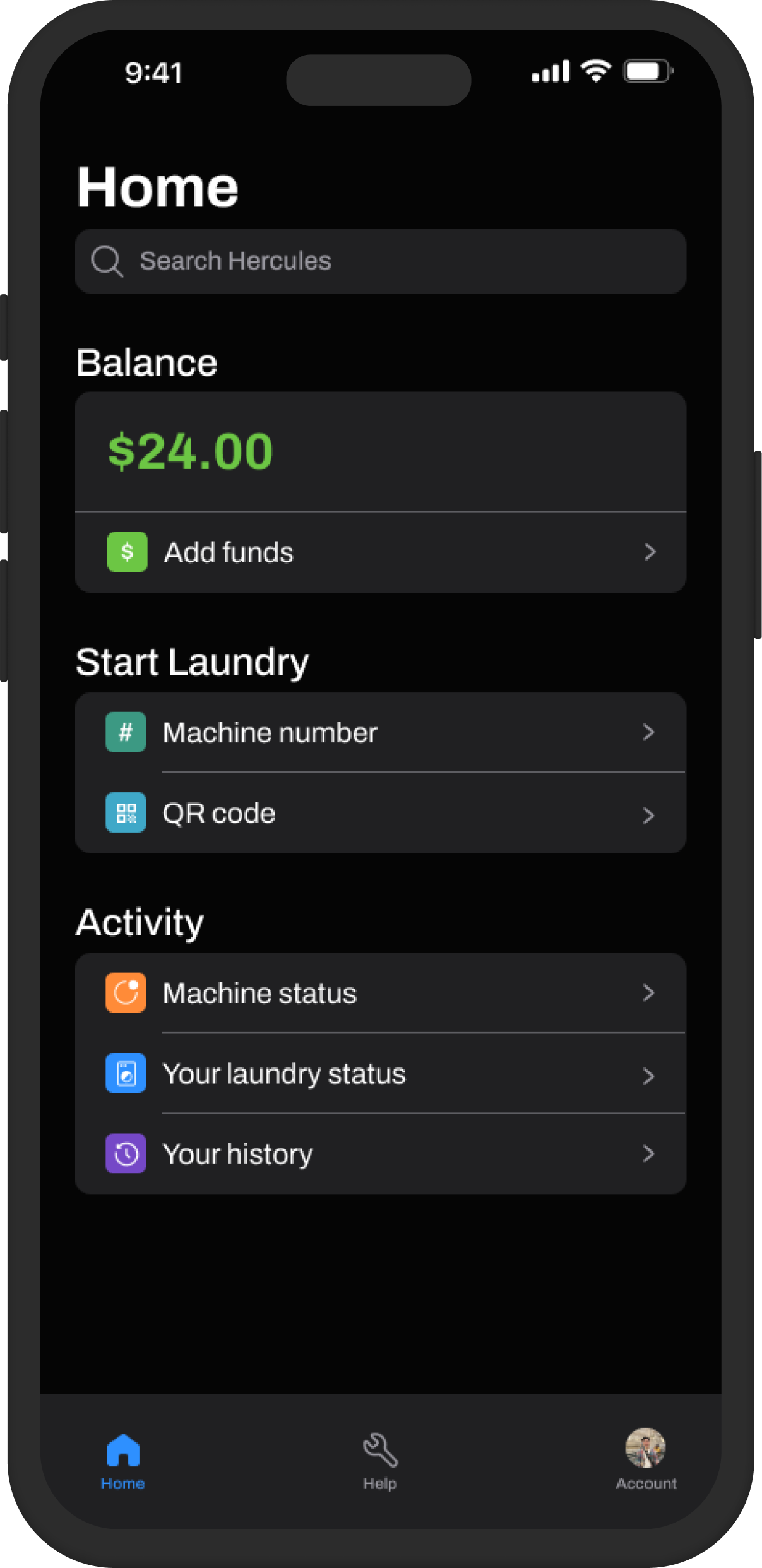
After wireframing and sketching potential ideas to establish more sense of the design direction, this was the outcome of the first high-fidelity mockup, which helped in defining the general layout and structure of the app (specifically emphasizing the user's balance and dividing the menu options into logical categories) moving forward.
Iteration 02
Envisioning the main screens and initial features / details
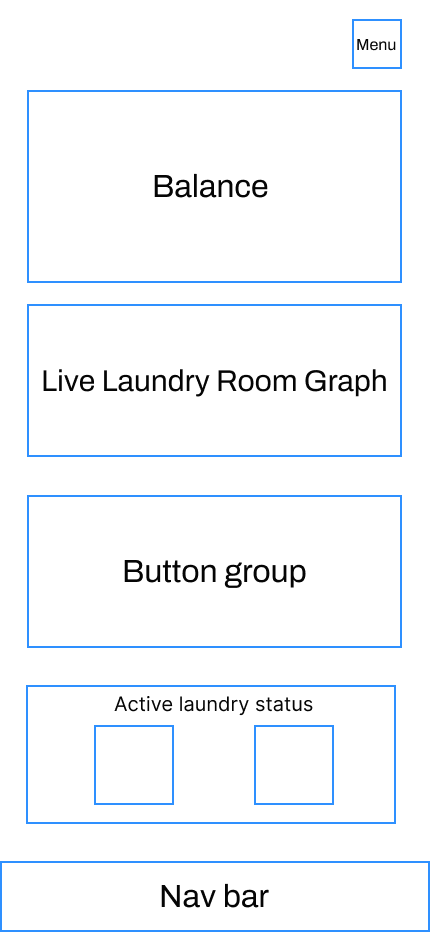
Slightly evolving from the first mockup, I figured it'd be interesting to treat the app's design similarly to modern crypto apps since the base purpose of both apps is for users to load money into their accounts and pay for things.
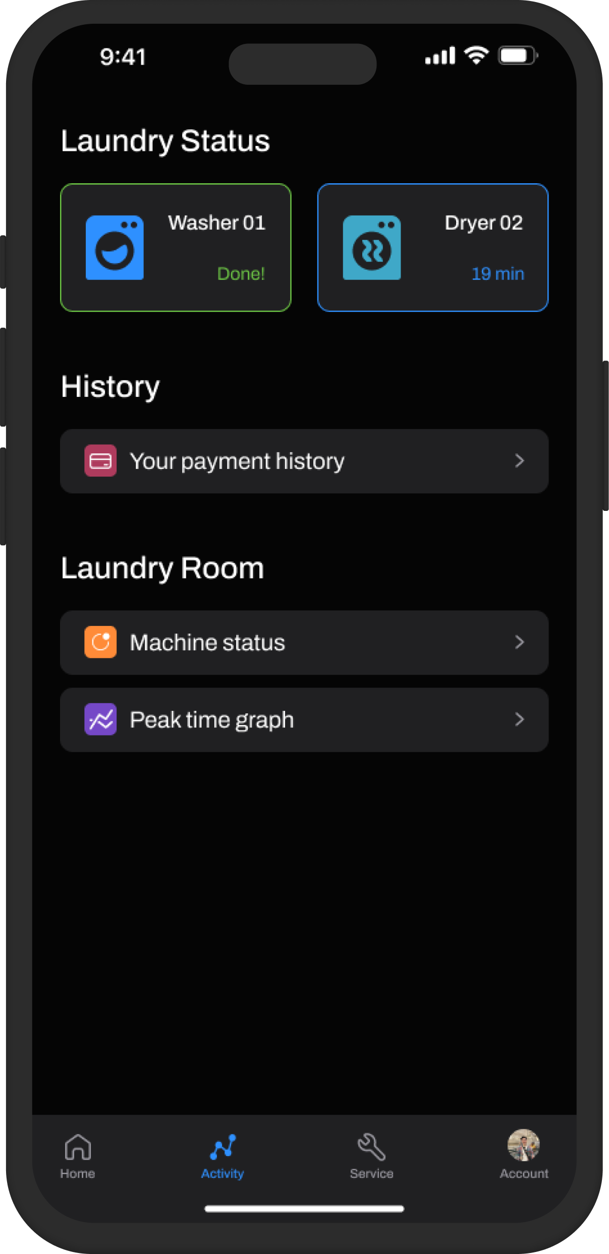
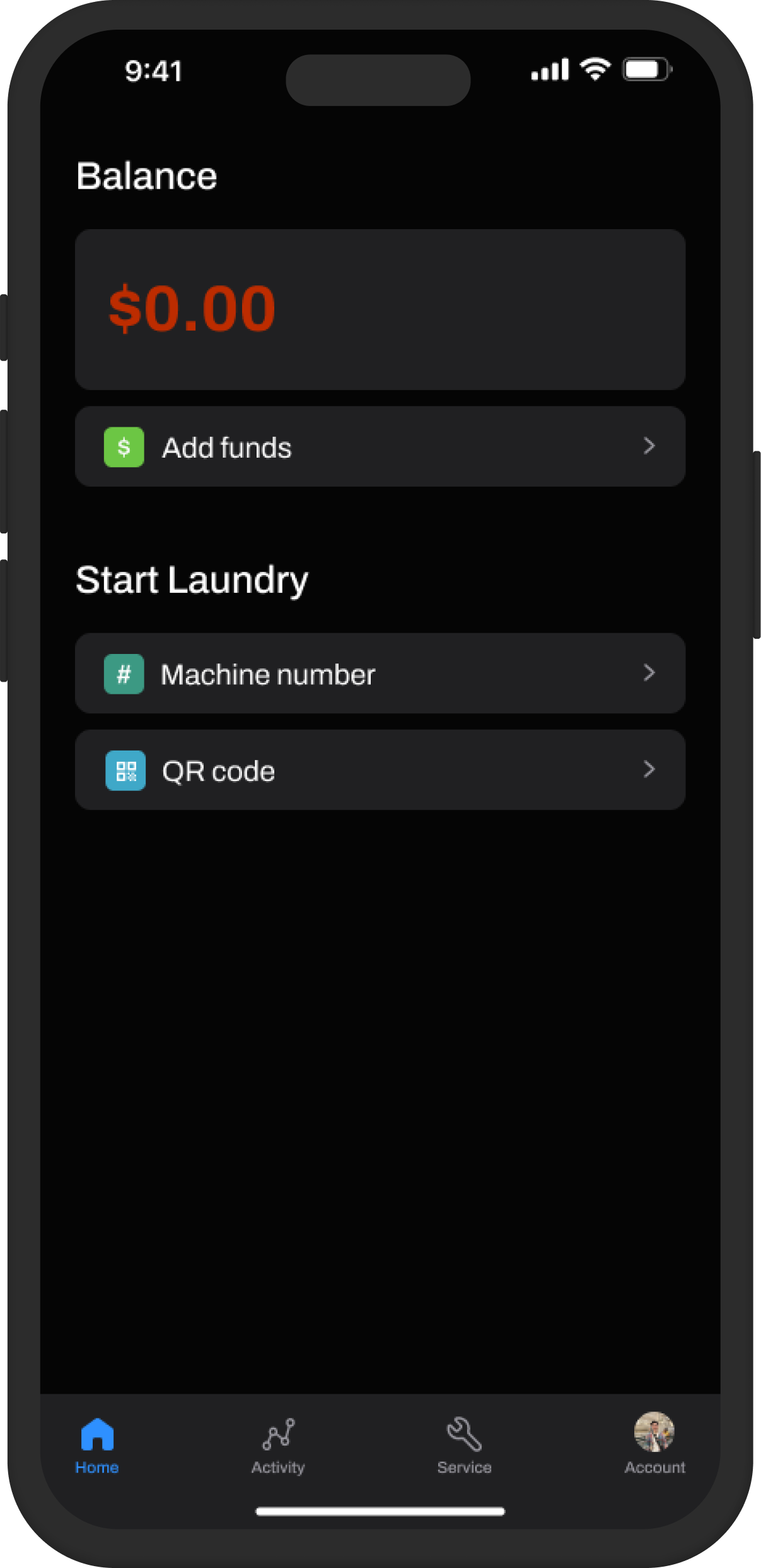
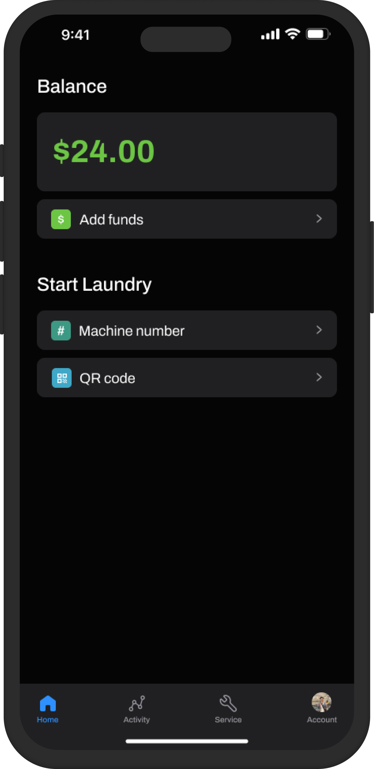
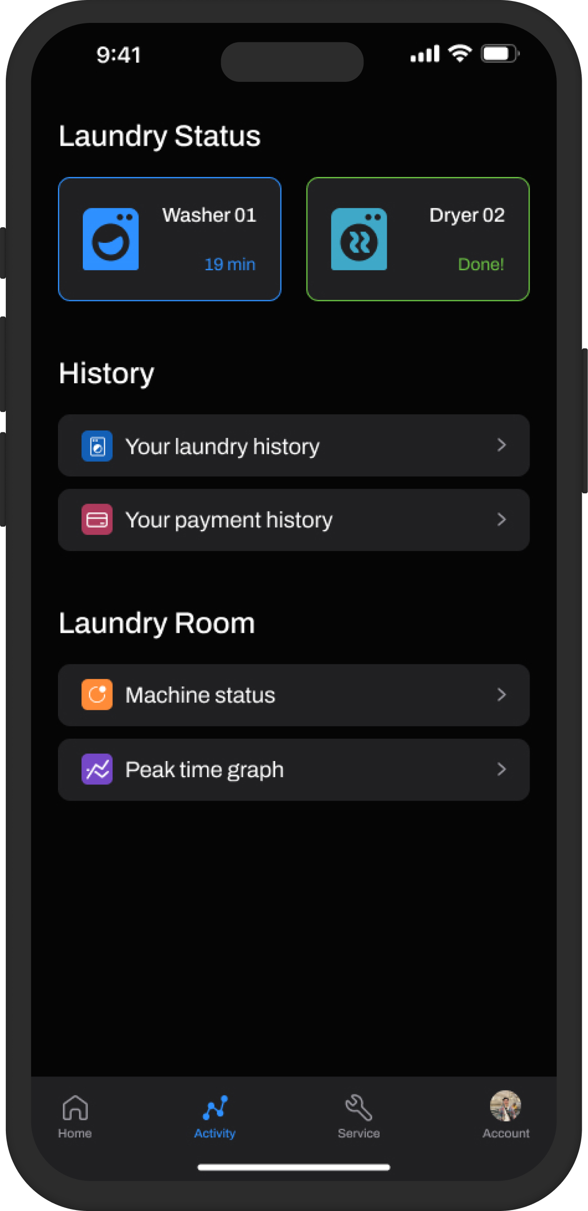
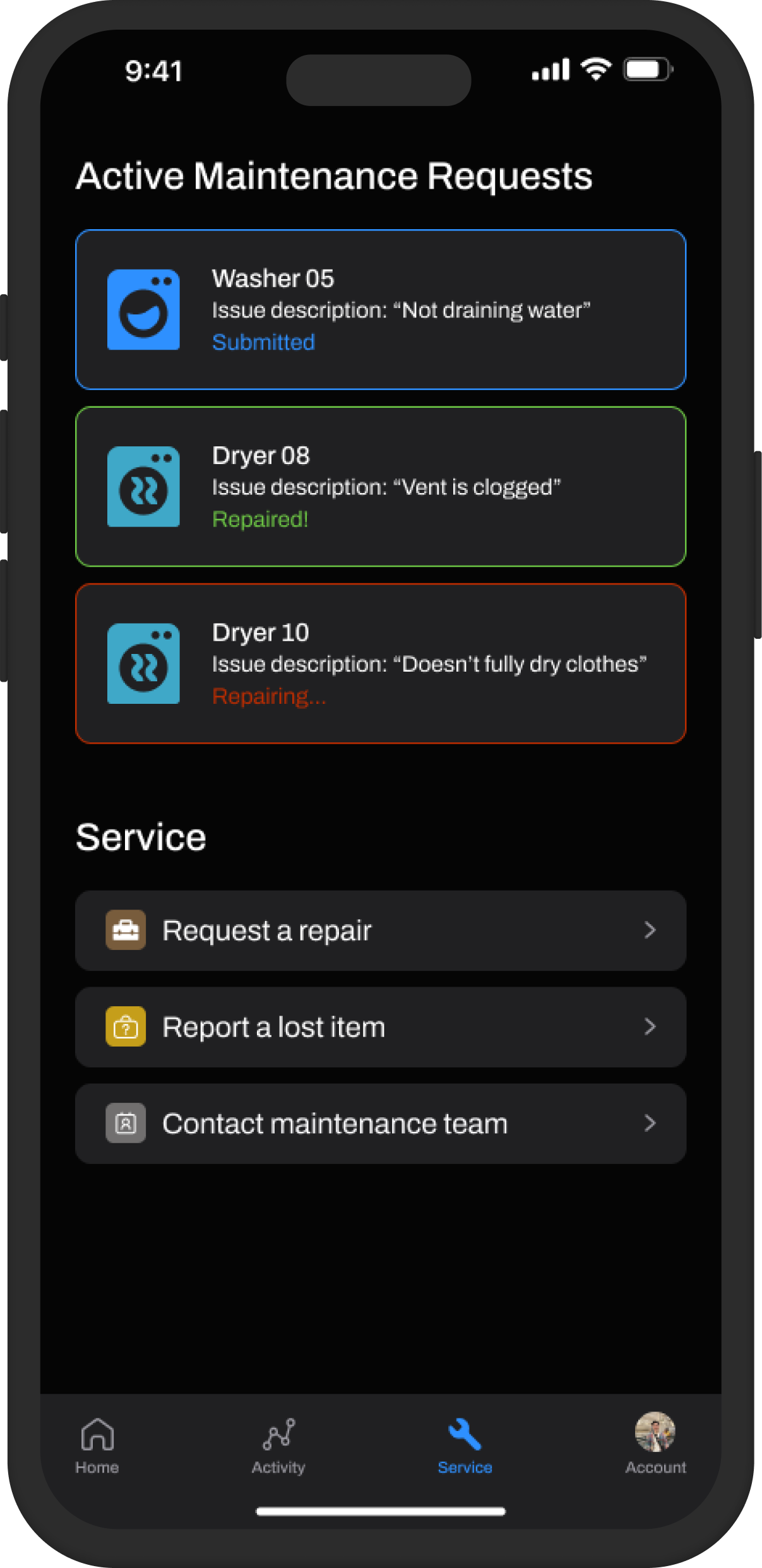
For example, with crypto apps, users can add money to their accounts, see their account balance clearly, and check the statuses of their investments. For Hercules, users can also add money to their accounts, see their account balance clearly (through emphasis of the font size and red / green color, which cognitively helps them interpret this information faster than reading), and check the statuses of their laundry or maintenance requests (via modular tile components).
Iteration 03
Building out the initial flows
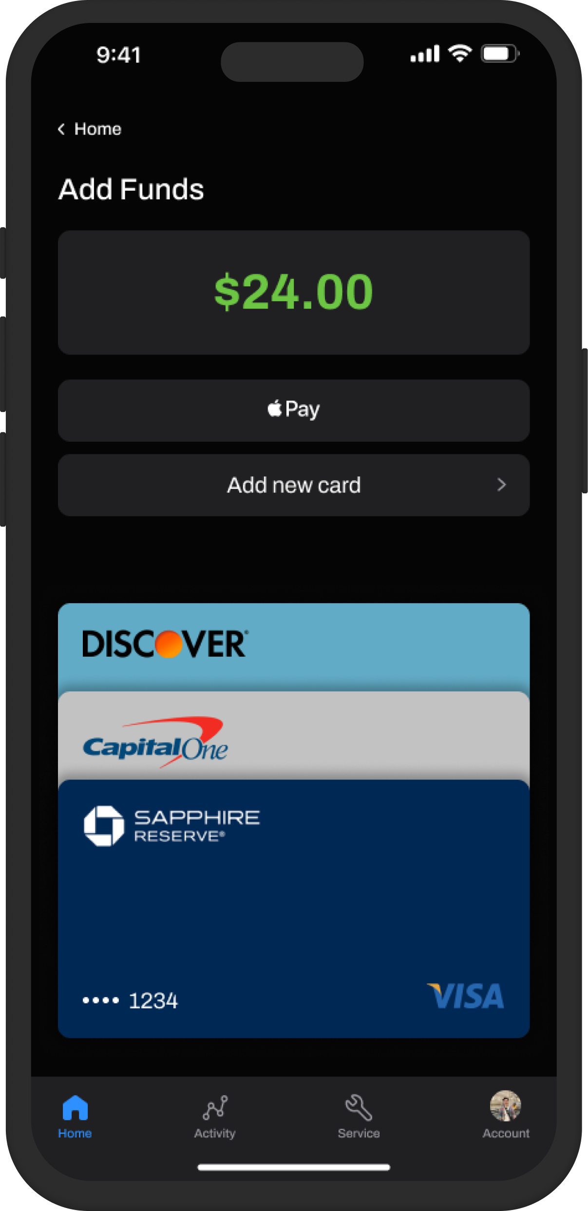
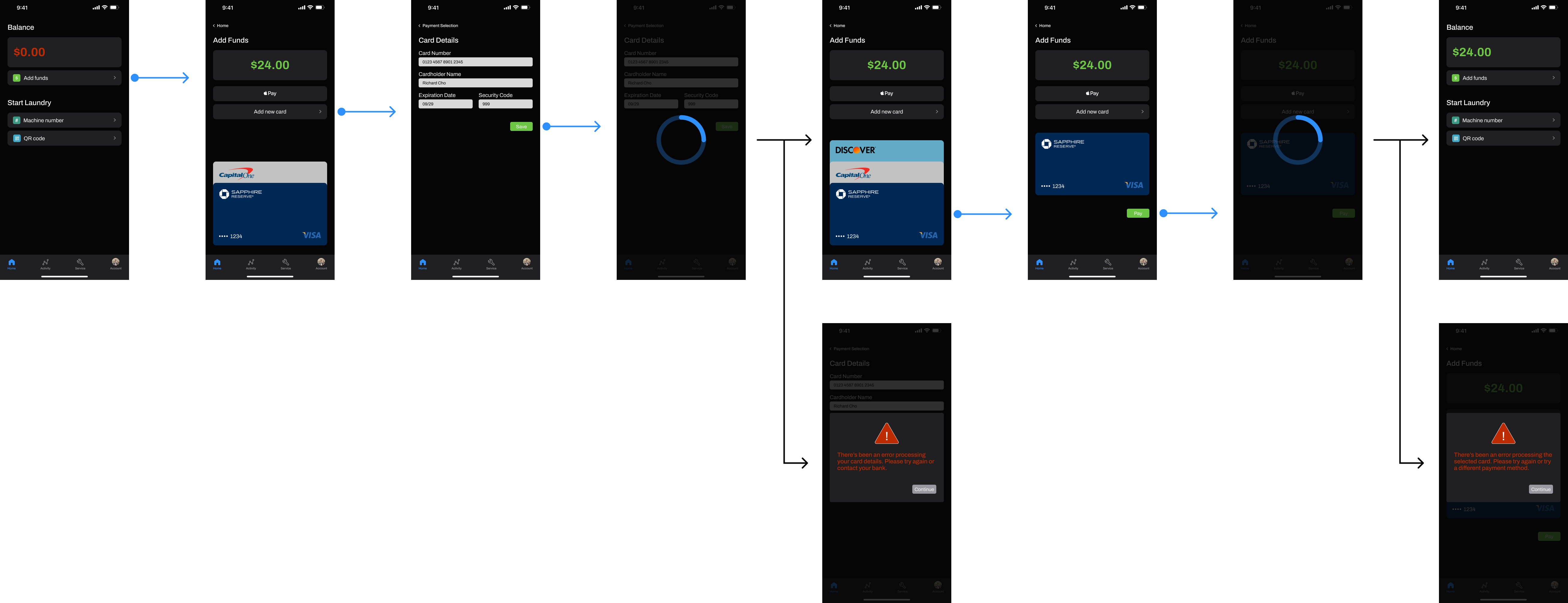
Building off of the previous iteration, I ideated more flows for each of the screens and fine-tuned more details for the different possible user journeys, such as this flow for adding funds to a user's account. Users can add / pay with new cards, use Apple Pay, and access their saved payment methods via a card stack.


A/B Testing
Using data as my guide
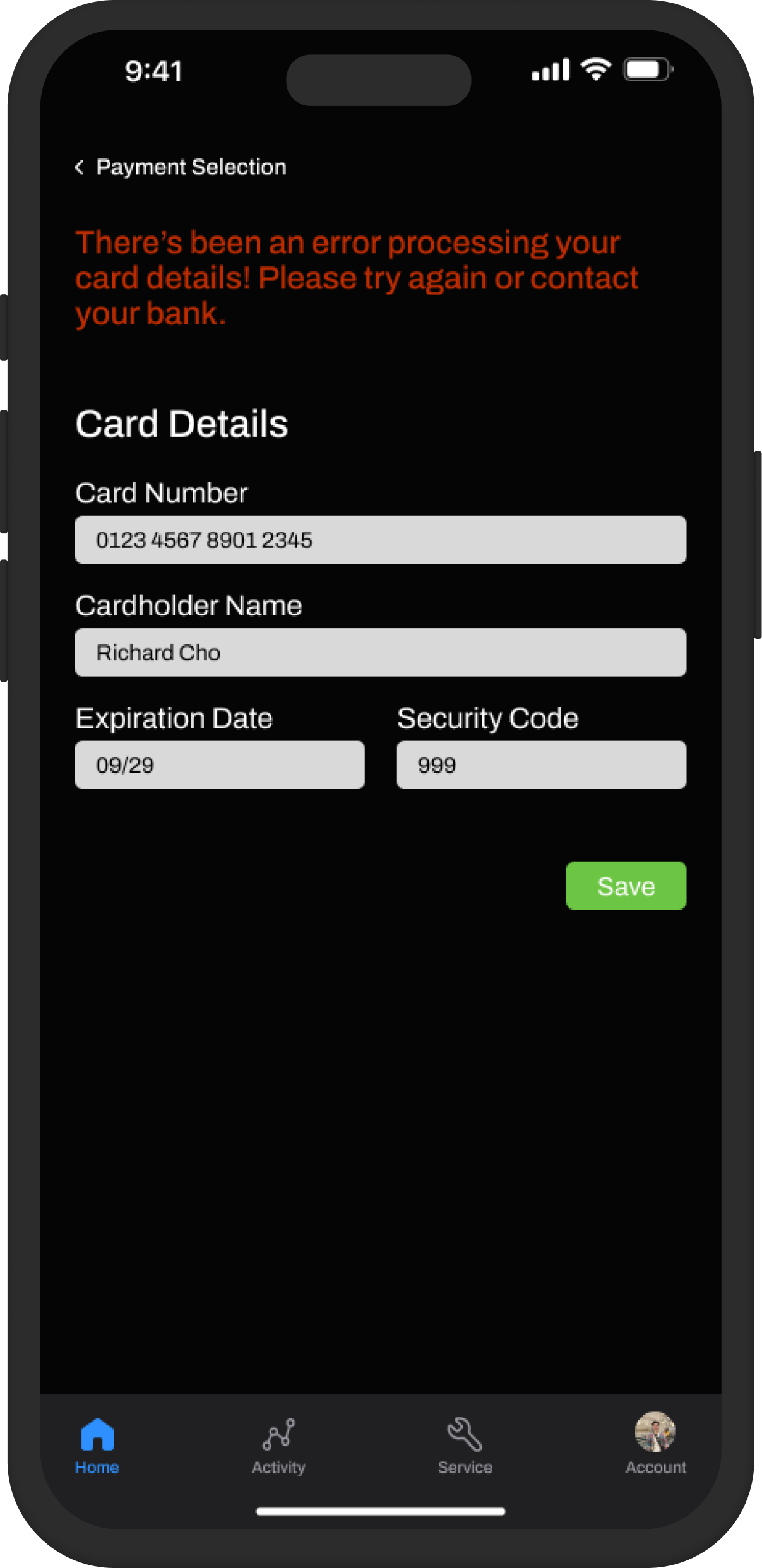
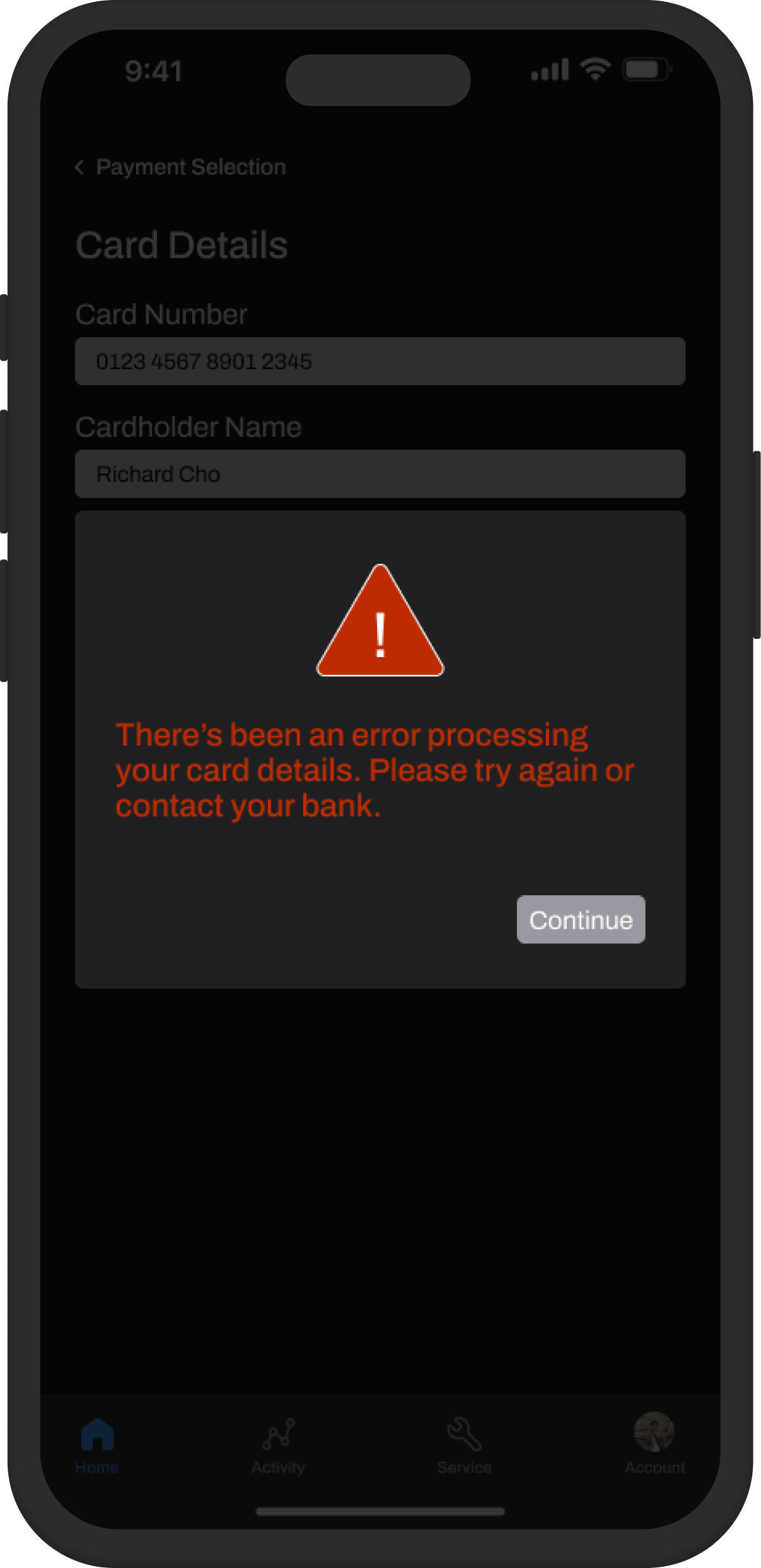
Throughout designing, I did A/B testing with users to get feedback to iterate upon. For example, for the error state, 90% of users preferred the design with the modal window because of reasons like:
- “Sometimes after refreshing the error can remain. It would allow me to know which click caused it.”
- "I like when an error message screen pops up, rather than some text that I might miss otherwise."
- "I like the visual design that it's clear there is an error."
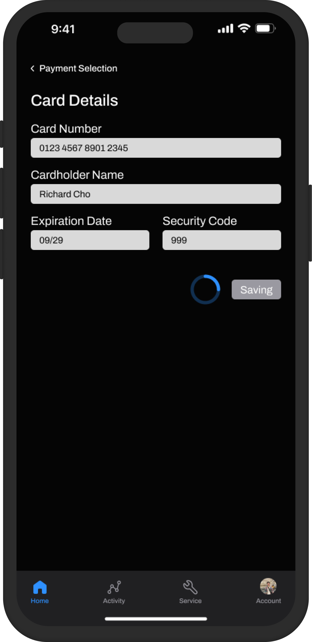
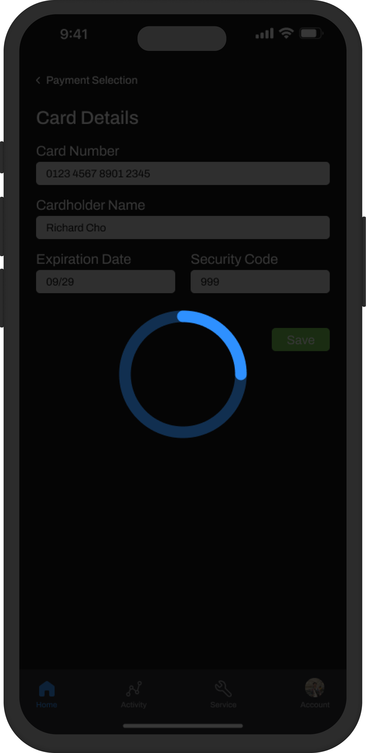
Similarly, all users preferred the overlaid loading animation because:
- “It's more obvious.”
- "I know for sure that it's loading. I feel like some people might not catch onto the small loading icon next to the button."
10%
90%
0%
100%
Iteration 04
Fleshing out and improving the flows
Expanding more on the previous flow to add funds, users had to simultaneously pay with a card in order to save it, but there are many cases in which this could be a pain point. To test this, I did more A/B testing and found that my theory was correct as the vast majority of users preferred decoupling the two, as it introduces friction when starting their laundry process.
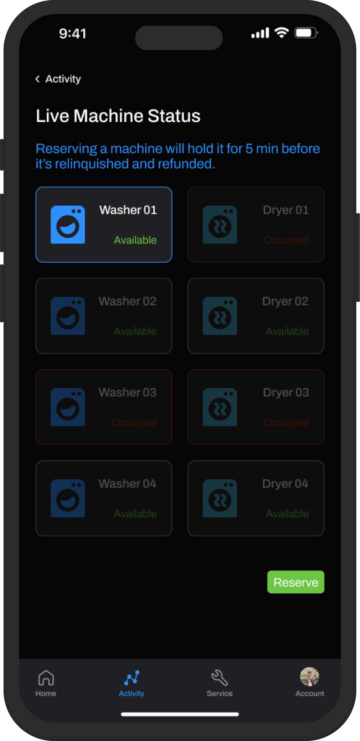
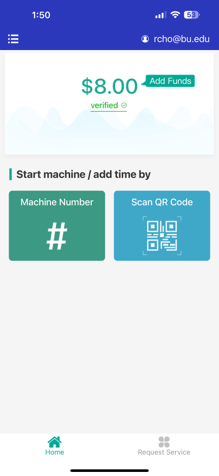
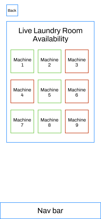
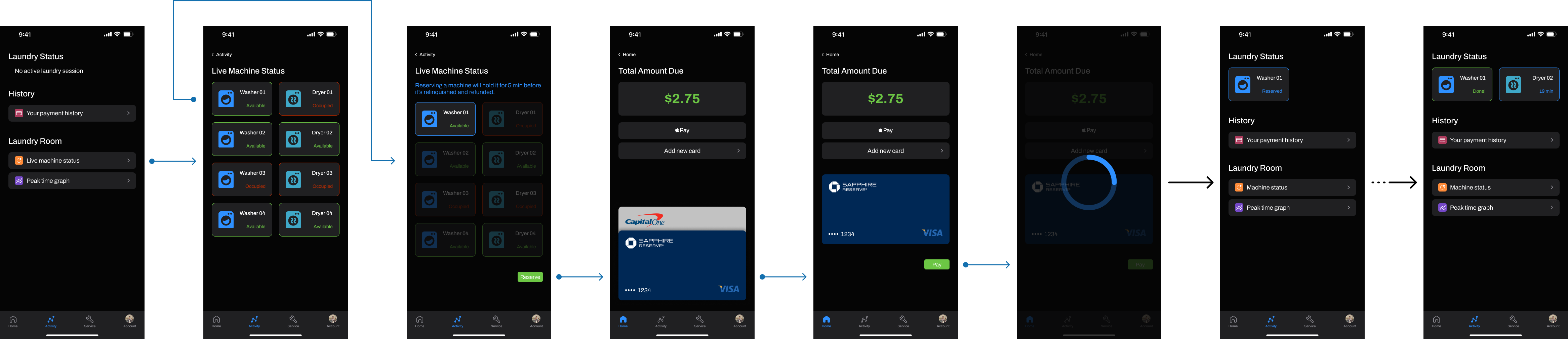
Moreover, when users want to do laundry, how do they know if any machines are even available? The next flow expands on the tiles feature I created in previous iterations, in which users can see all machines in their laundry room mapped out and their statuses. Users can also activate a reservation flow to hold a machine for up to 5 min before it's relinquished and refunded. This avoids frustrating situations in which a machine gets taken during the time it takes a user to see an available machine and physically go to the laundry room. Again, to validate this feature, I asked the users what they thought in a follow-up question and they all responded positively to this feature.
Final Results & Impact
At a high level, I organized the features into logical categories and completed / fleshed out more of the main flows that users were experiencing as pain points. Now since this was just a side project, I wasn't able to capture any real-life metrics; however, I asked users which design they'd prefer in the end and 90% preferred the redesign.
If this were to be launched, I'd like to iterate further with the designs and collect more user metrics / behaviors, as well as do more testing to validate that the redesigns are achieving our goal of ultimately elevating and streamlining the user's experience.